How to setup gnuplot and make plots in orgmode
GNUPLOT is a powerful plotting engine. To install gnuplot in orgmode you need to follow the instructions online and put in your Emacs init file the following chunk to activate gnuplot in babel.
;; active Babel languages
(org-babel-do-load-languages
 'org-babel-load-languages
 '((gnuplot . t)))
;; add additional languages with '((language . t)))
Eric Schulte, the author of babel, has many examples in his org-scrapts, but also check Org-Plot page and the tutorial for plotting tables using org-plot.
For plotting tables I am using the instructions from Org-Plot. I am running the Emacs-lisp command src_elisp{ (local-set-key "\M-\C-g" 'org-plot/gnuplot) } (this format is inline code chunk in orgmode), which defines a local keyboard shortcut for M-C-g in order to run gnuplot.
The source code below plots the table as a histogram using the M-C-g.
#+PLOT: title:"Grades in Physics and Mathematics" ind:2 deps:(3 4) type:2d with:histograms set:"yrange [0:]" set:"xlabel 'Student'" set:"ylabel 'grades'" set:"output './img/gnuplot-grades.png'" set:"terminal png size 600,500"
|---+--------+-------------+---------|
|   | Grades | Mathematics | Physics |
|---+--------+-------------+---------|
| # | Ben    |         9.2 |     9.9 |
| # | Tom    |         6.7 |     7.7 |
| # | Tim    |         7.5 |     6.7 |
| # | Dean   |         8.0 |     7.0 |
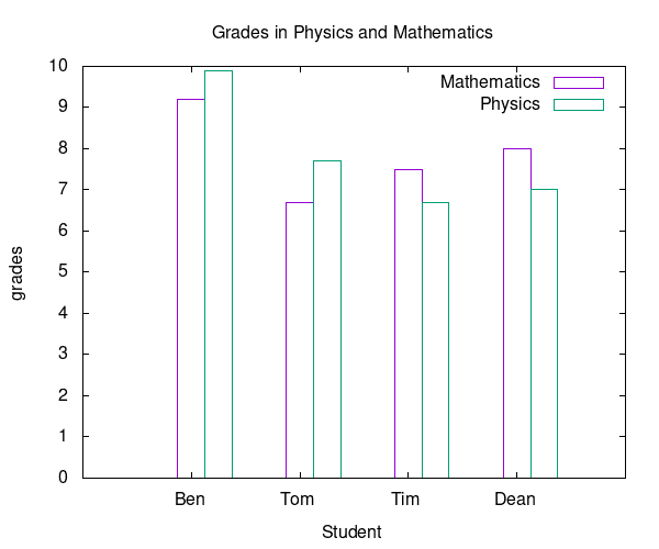
Figure 1: Plot histogram
Some important keywords for babel's definition are:
set: set any gnuplot commandind: specify which column will be the x-axisdeps: which columns hold the data
You can do the same plot by writing a gnuplot script. I noticed that using hashtags (#) in the first column of the table, you cannot access the data in columns. Following the first keyword using the 2:xtic(1) is collecting the data from the 2nd column and assigns the 1st column of the table as legends of the x-axis. After the second keyword using the ($3) reads the data from the 3rd column.
#+tblname: grades
| Ben  | 9.2 | 9.9 |
| Tim  | 6.7 | 7.7 |
| Tom  | 7.5 | 6.7 |
| Dean | 8.0 | 7.0 |

#+begin_src gnuplot :var data=grades :results output :file ./img/grades.png
set title "Students' Grades"
set yrange[0:10]
set style data histogram
set terminal png size 400,300
plot data using 2:xtic(1) title 'Maths', '' using ($3) title 'Physics'
#+end_src

#+RESULTS:
[[file:./img/grades.png]]
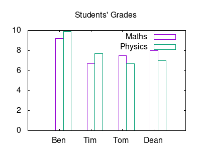
Figure 2: Change the size of the png output
If you don't want to assign legends on the x-axis you can use the command unset xtic. In this case you have to rewrite the last line as follows:
plot data using ($2) title 'Maths', '' using ($3) title 'Physics'